Pixel stretching, explained: the full Photoshop tutorial
The pixel-stretch look is having a moment. Open Instagram and you'll see it on every other automotive art page — a car held dead sharp while the world around it smears into long, clean bands of color. We've been building a whole stretch series of our own (tap the Stretch tab), and the question that lands in our DMs more than any other is some version of: how?
So here's the actual workflow. Not the 40-second reel version — the real one, with the settings, the order of operations, and the mistakes that make a stretch look cheap.
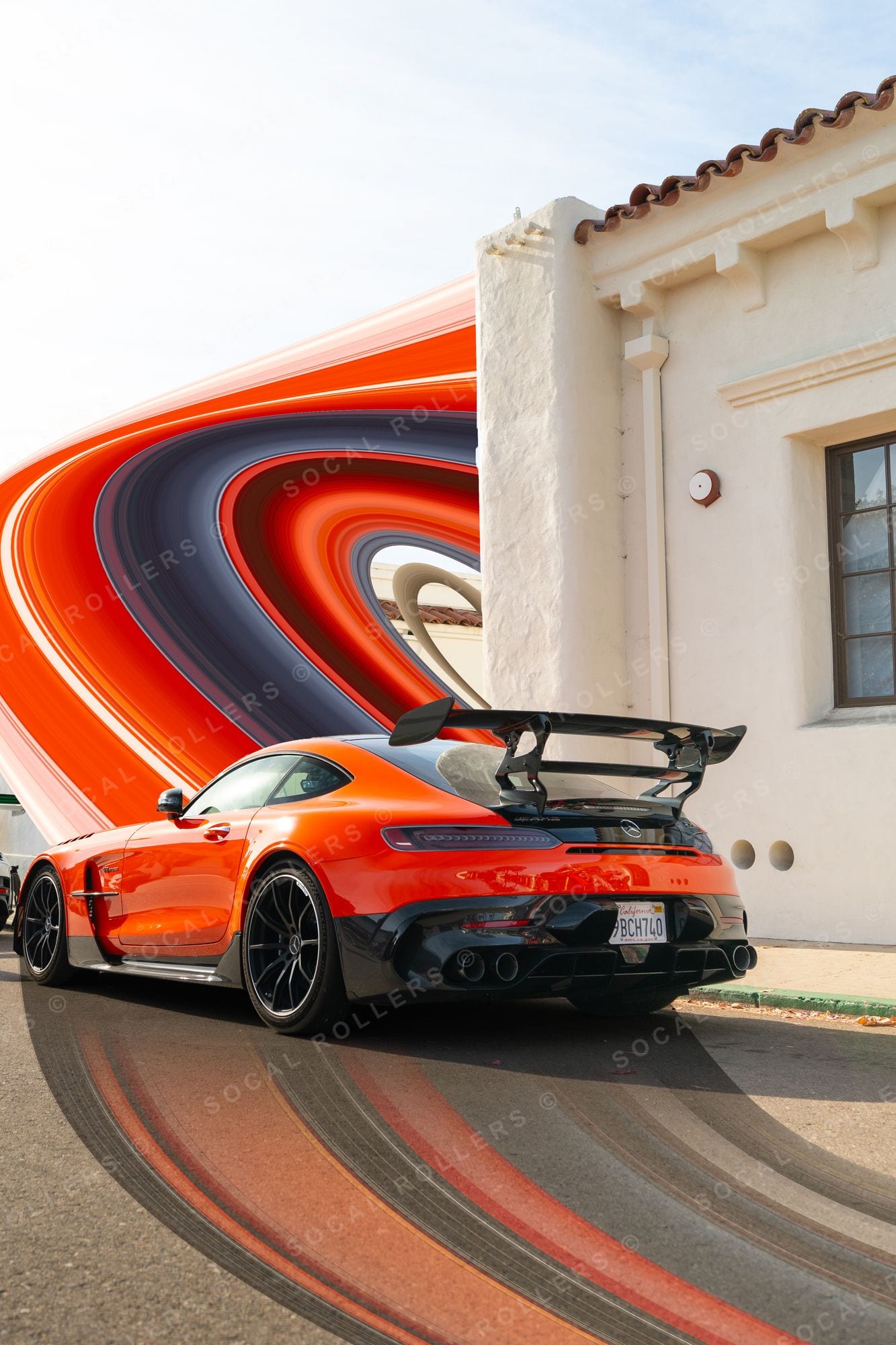 The AMG GT Black Series vortex — every band in that ring started as one row of pixels. See it in the archive.
What pixel stretching actually is
Mechanically, it's simple: you take a single row or column of pixels from a photograph and scale it across the frame. That one-pixel slice becomes a field of perfectly straight streaks, because every value in the slice just repeats in a line. Done carelessly it reads as a glitch. Done deliberately — anchored to the right edge of the right subject — it reads as speed, architecture, and intent.
It works unreasonably well on cars. A car is a machine made of long horizontal lines, and the stretch extends those lines past the bodywork into pure graphic space. The car stays photographic; everything else becomes design. That contrast is the whole trick.
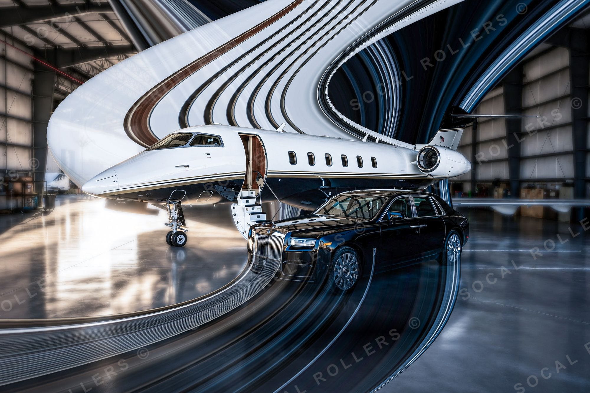 It works on more than cars — here the jet's livery is the slice. Full frame.
What you need
- Photoshop — any recent version; the technique is decades old (its DNA goes back to early glitch-art and slit-scan experiments, long before it hit car pages)
- A high-resolution frame — stretching exposes resolution sins; start from the full-res file, not a screenshot
- The right photo — clean subject edge, simple background, and ideally a strong horizontal or vertical line to stretch from. Statics and three-quarter shots work; busy backgrounds fight you
If you want to study finished examples while you work, keep our Green GT3RS stretch or the Porsche warp open in another tab. Both started exactly the way described below.
The step-by-step
1 · Prep the base layer
Open your image and duplicate the background layer (Ctrl/Cmd + J) so you're never destroying the original. Do your basic grade first — exposure, white balance, contrast. The stretch inherits whatever color is in the slice you pick, so grade before you stretch, not after.
2 · Pick your stretch line
This is the decision that makes or breaks the piece. You're looking for a one-pixel slice where the colors are worth repeating — usually right at the car's roofline, beltline, or the edge where bodywork meets background. Zoom to 200–300% and study what's actually in that row of pixels.
Grab the Single Row Marquee Tool (or Single Column for a vertical stretch — that's the move for tall 4:5 crops). It's nested under the regular Marquee in the toolbar. Click once at your chosen line and you've selected a one-pixel slice across the entire image.
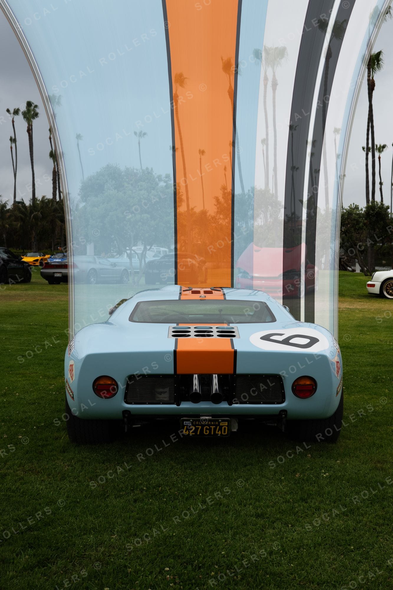 Picking the line is everything: on the Gulf GT40, the stripe is the slice. Full frame.
3 · Lift the slice
With the selection live, hit Ctrl/Cmd + J to copy that slice to its own layer. It'll look like nothing happened — it's one pixel tall. That's fine. Then right-click the new layer in the Layers panel and choose Convert to Smart Object — the transform you're about to do stays non-destructive, so you can re-pull or resize the stretch later without the slice degrading.
4 · Stretch it
Select the slice layer and hit Ctrl/Cmd + T for Free Transform. Grab the top or bottom handle and drag — hold Shift while you drag so the pull stays locked to one axis instead of skewing. The slice extends into a field of perfect streaks — pull it as far as the composition needs, even past the canvas edge. (Adobe's own transform documentation covers the mechanics if Free Transform is new to you.) Commit with Enter.
For a vertical composition, same idea rotated: single column, transform sideways.
5 · Mask the subject back in
Right now the stretch is covering your car. Add a layer mask to the stretch layer, take a soft black brush (or make a clean selection of the car first — Select Subject does a decent first pass), and paint the car back into view. Take your time on the edge where sharp bodywork meets the streaks. A hard, honest edge usually beats a soft feathered one — feathering here is what makes amateur stretches look like a smudge instead of a decision.
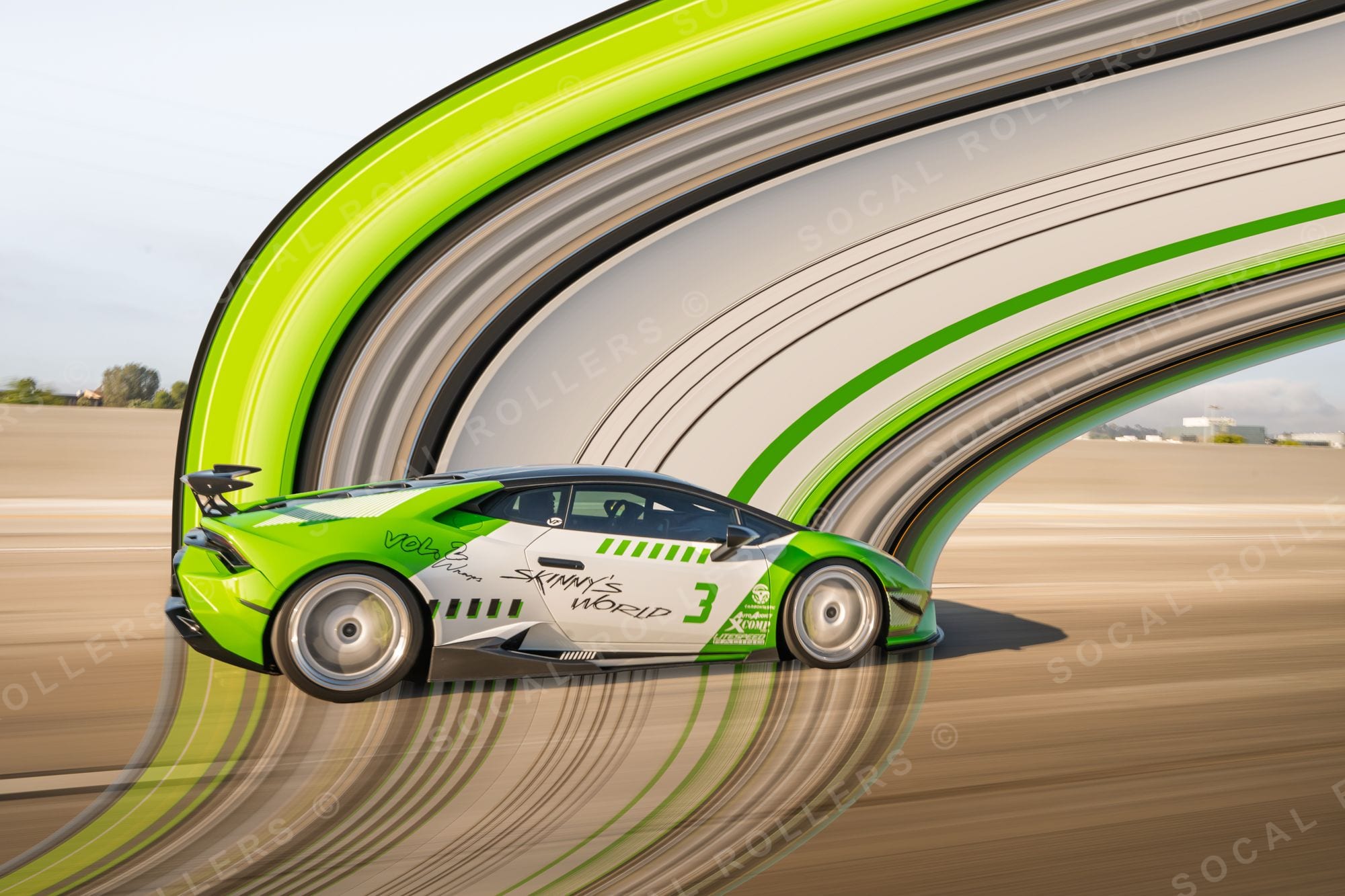 Masking done patiently: the car stays dead sharp while the arc owns the sky. Full frame.
6 · Blend the seams
The transition where the stretch begins can sit too abruptly against the unstretched image. Two fixes, used together:
- Gradient on the mask — pull a short black-to-white gradient on the stretch layer's mask so the streaks fade in over 50–150 pixels instead of starting on a hard line
- Motion Blur on the stretch — Filter → Blur → Motion Blur, angle matched to your stretch direction (0° for horizontal, 90° for vertical), distance somewhere between 20–80px. This melts the banding inside the stretch itself
7 · Match the grain
This is the step everyone skips, and it's why their stretches look pasted on. A stretched slice has zero noise texture — it's mathematically smooth — while your photograph has grain. Add noise back to the stretch layer (Filter → Noise → Add Noise, 1–3%, Gaussian, Monochromatic) until it sits in the same world as the photo. At print size this is the difference between an art piece and a Photoshop exercise.
8 · Grade the composite
Flatten to a new layer (Ctrl/Cmd + Shift + Alt/Opt + E) and grade the whole thing together — a unified curve, maybe a color cast that ties streaks and subject into one palette. We usually finish darker and warmer than feels right on screen; it holds up better in print and on the feed.
9 · Crop and export
The stretch look loves extreme aspect ratios. Tall 4:5 and 2:3 crops dominate our own series because vertical streaks plus a vertical frame doubles the effect. Export full quality for print; 2048px on the long edge is plenty for Instagram.
 Tall crop, vertical pull — the format doing half the work. Full frame.
The mistakes that give it away
- Stretching a busy slice — if your one-pixel row crosses a fence, a crowd, or text, the streaks come out muddy. Hunt for a cleaner line.
- Low-res source files — the stretch is smooth but the car is mush. Always start full-res.
- Skipping the noise match — smooth streaks against grainy photo equals sticker effect.
- Over-feathered masks — commit to the edge.
- Stretching everything — the strongest pieces keep most of the photograph intact and let one confident stretch do the talking. Restraint reads as skill.
Go look at the real thing
Reading about it only gets you so far — go study how the edges, grain, and crops behave on finished pieces in the Stretch collection, all shot and built in-house from our own frames. Every one of them is licensable, and the hero pieces are headed for the print run.
And if you'd rather have your own car turned into one of these instead of fighting layer masks on a Tuesday night — that's literally what we do.